I'm so sick of politics right now. I need a break from talking about it. So I'm doing something silly.
We're ranking the NFL mascots, based on name, connection to the team/city name and look. It is entirely subjective. Points are awarded for unique items and taken away for being boring or scaring children.
T-32. New York Jets/Green Bay Packers/New York Giants/Washington Redskins — They don't have a mascot. Default loss.
28. Raider Rusher -- The NFL had a short-lived children's show on Nickelodeon that was... all sorts of a mess. At any rate, every team had its own "Rusher" figure. The Raiders, since they didn't have a mascot, decided to just make the Raider Rusher their actual mascot. It's just a Raider helmet with arms and legs. He looks like a Graveler.
27. Boltman -- At least it's not the NFL kids show mascot, but YIKES! I can't imagine any kid wanting to stand near this guy. Give him credit for dental hygiene and eye protection, but he's just creepy. He looks like Jim Carrey's The Mask mated with a Cheesehead.
26. Big Red -- It's just a generic cardinal. It doesn't even have a clever name. Put it in a Jewell jersey, and you'd think he works here on campus (Jewell's mascot is also the cardinals). Points given for remembering tail feathers. He looks like every other "Cardinals" mascot.
25. Who Dey -- This is the question you ask upon seeing this mascot. He's just a generic tiger. There's nothing unique about him, other than the name. He looks like the LSU Tiger's orange cousin or if Timber the Tiger from Diddy Kong Racing grew up.
24. Rampage -- Just a generic ram. You'll forget about him by the time you get to the next one. He looks like a high school mascot in a Rams jersey.
23. Roary -- Just a lion, but he looks like a nice lion. The name is both clever and groan-inducing, like good mascot names should be (MSSU liked it enough to name their lion Roary as well). He looks like a teenage lion that hasn't quite grown into his body yet, but will be a contributing member of society soon.
22. Miles -- I had a hard time placing Miles on this list. Part of that is my dislike of the Broncos. Part of that is I liked their old logo, so anything associated with the redesign has earned my ire. But I think he ranks so low because he just looks mean. He looks like if Bad Horse from Dr. Horrible had been a mascot rather than an actual horse.
21. Sir Saint/Gumbo -- Gumbo is a big, nice-looking, yet forgettable dog. He's got a nice name with the New Orleans tie-in. Sir Saint is frightening -- his head is clearly smaller than his jaw. I fear for that guy. Also, saints are not knighted, so what's with his name? Gumbo looks like the 1990s brand Big Dog wore a jersey, while Sir Saint makes you wonder if faces can have badonkadonk.
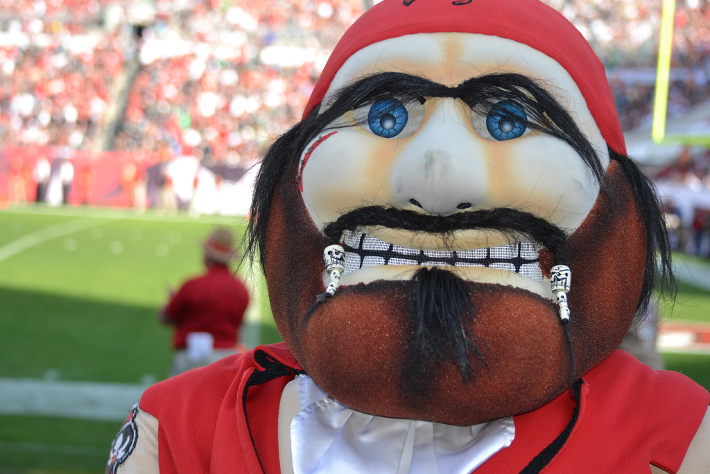
20. Captain Fear -- This was the one that rose the most after my initial rankings. He gets a few points for having an actual costume instead of the lazy "team jersey" outfit. Points for facial hair, but it's a beaded fu manchu (?) with a soul patch and overgrown eye brows. That said, he's not really well done. I'm sure there are some high schools with a better-looking "pirate" character. He looks like a rough draft of Jack Sparrow that was immediately discarded.
19. Toro -- Toro is the best baseline for comparisons. He really doesn't have much going for him — he's just a bull in a jersey. But the head has a smile and the eyes are welcoming and friendly. Anything ranked higher is just more unique, but anything below him is scary/creepy/has a major flaw. He looks like if the cattle industry had its own mascot.
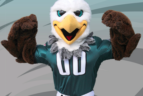
18. Swoop -- A really generic eagle mascot, but I give credit for minor differences. Eastern Michigan also has a similar-looking eagle mascot named Swoop, but the Philadelphia Eagles gave their Swoop distinguishing feathers along the neck. That puts Swoop a little bit higher. He looks like a DARE mascot for patriotism.
17. Chomps -- I can not decide in the Google Images search if he looks nice or intimidating. I think it comes down to teeth. When the teeth are in, he looks creepy. When they take his teeth out, he looks like fun. Points awarded for not only wearing his team's jersey (lazy) but also wearing his team's helmet, albeit customized for his giant head. He looks like if Mega Man and Rush got combined and color-swapped.
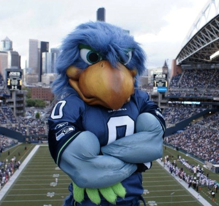
16. Blitz -- Dropped three spots when I realized they replaced this with this. It's a downgrade. The previous version had beefy arms and looked more fun. The new version is just a tad bit more generic, less colorful and more animal-looking. On the scale of NFL mascots, though, it's still pretty good. The colors pop and the wings are neat. Points definitely taken away for his version of Baby Jay, the awful teenager-looking Boom. Blitz looks like the Windows Millennium edition of the mascot. Boom looks like Bird Poochie.
15. Blue -- At first I thought he was a unicorn before I realized it's just a white mane. He's zany/goofy like many good mascots are. He's distinguishably fat. He's also blue, which is fine -- it helps make him unique. A solid middle-of-the-pack mascot. He looks like if one of those oversized carnival toys got a professional makeover.
14. Billy Buffalo -- Short, stubby face is a different look than most animal mascots with snouts. He's got an interesting color. He's got facial hair in the form of a shaggy beard. Boring name, though: The Buffalo Bills have a mascot of Billy the Buffalo. Meh. His eyes are a little scrunched together and the eyebrows are up, which means he constantly looks surprised in a bad way. He looks like he's shocked to find out he's not a blue ogre.
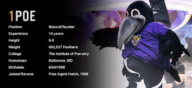
13. Poe -- This is how you make a boring bird (ravens aren't particularly interesting visually) into a decent mascot. Nice, long beak. Cool wings. A version of the team jersey while not actually being the team jersey. Nicely done. Points taken away because the team retired his "brothers," Edgar and Allen. You could have had the only three-mascot team, Baltimore. Points gained for graduating from "The Institute of Poe-etry." He looks like if the Night's Watch had a mascot for befriending Wildling children.
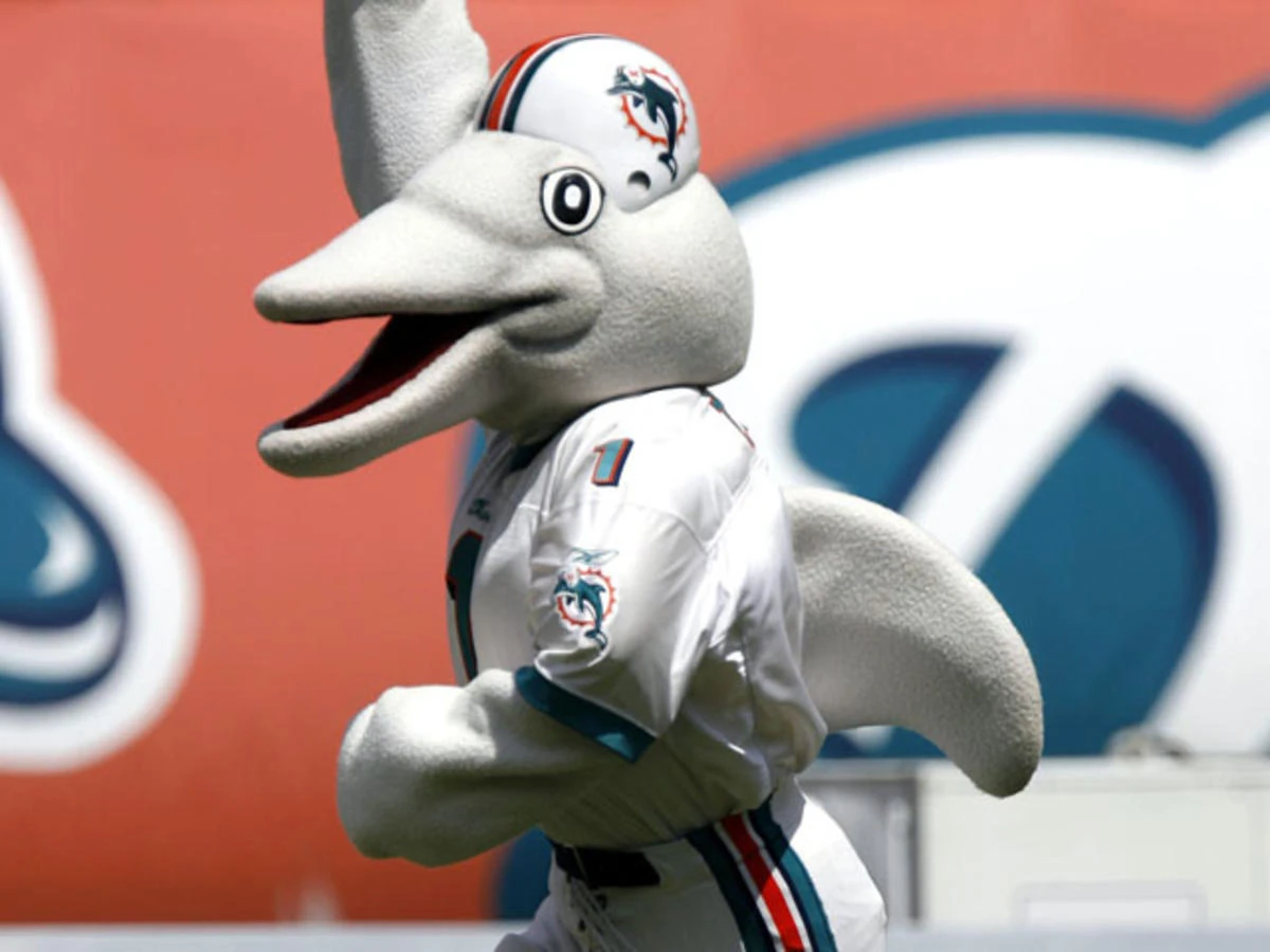
12. T.D. -- This one was helped by the little features. On one hand, he's a pretty generic dolphin. But a dolphin is a unique mascot. He gets points for being a helmet-wearing dolphin, with a dolphin wearing a helmet on his helmet. Maybe it's himself on his own helmet. It's mascot Inception here, folks. They also remembered the dorsal fin (!) and the fact Dolphins don't have fingers -- just fins. It's attention to detail. He looks like Sea World rejected a mascot and asked if the Miami team wanted to throw their jersey on and call it a day.
11. Freddie Falcon -- I feel like they put work into him. He's got detailed tail feathers. He's got both hair and detailed feather work on the face, and it's blended nicely enough you might not notice on first glance. His eyes are big but not intimidating or dopey looking. I was most surprised by him. He looks like if Scooter from the Muppets was turned into a bird.
10. K.C. Wolf -- I bet you most people don't know why the Chiefs have a wolf mascot. I don't, and I'm a Chiefs fan. They used to (Note: USED TO) have a section of fans called the Wolfpack. They don't anymore. That said, he's friendly-looking, fat (a good quality in a mascot), zany, and has googly eyes. He also has a unibrow, for unexplained reasons. What I'm saying is that if you are going to go with a wolf mascot, make him unique. He's memorable, even if his reason for existing isn't. He looks like if the Sheriff of Nottingham had been turned into comic relief.
9. T-Rac -- Points definitely, definitely taken away for being a raccoon. The team's name is the Titans. Why is he a raccoon? Because the state animal of Tennessee is a raccoon. That seems like a social studies lesson instead of sound mascot logic. Although he looks vaguely cat-like, he's got the raccoon eyes and striped tail and just looks like no other mascot out there. He looks like the mascot for an also-ran in the Console Wars.
8. Sir Purr -- I love names that rhyme. Although a little on the generic side, they have little touches that are smart: whiskers and being fat. He also has "Sir" written on the bottom of one paw and "Purr" on the other. Awesome. He gains points for having a decent-looking Baby Jay version called.... Mini Meow. HAHAHAHA... Awesome. He's above K.C. Wolf and T-Rac because he's actually representative of the team name and he has his own unique jersey. He looks like he is as surprised as you are that he's good at this.
7. Staley Da Bear -- On one hand, he's a generic bear. I mean, he has a few nice touches, like the canine teeth jutting out from the bottom. He doesn't look exactly like every other bear out there. He looks cute and tough, which is a rare combo to pull off. But Staley's up this high almost entirely off his name. Staley is named after the team's founder, A.E. Staley, so he's got team history tied in -- a great thing for one of the few teams with a ton of history. And he's also "Da Bear" because of the great SNL skits from the 80s/90s about DAAA Bears. Great name. Average costume. He looks like the bear Teddy Ruxpin wants to be when he grows up.
6. Rowdy -- Of the "white guys with jobs" group (along with the next four on this list), he's the most goofy looking. There's a point where goofy looking crosses from "good" into "a little too much," and Rowdy is straddling the line. But I'm partial to mascots that don't try to do too much and fit with the team name. Points for the bandanna and Texas-sized hat. He looks like a mascot for the Wacky World of Tex Avery.
5. Pat Patriot -- He loses points for having his name be the first syllable of his ... last name (?). He just looks like the logo turned into a mascot, which is a positive. I like his hat and gloves. He loses a few points for the bulbousness of his face, though. He looks like Gaston with a goiter.
4. Sourdough Sam -- He's got an adjective in front of his name that is fascinating and tells a mini-story. They luckily gave him back his beard instead of making him look like a cosplaying version of the next mascot on our list. He's a ginger! He's got a pick! He's wearing overalls! He's got a silly hat! He looks like if Yosemite Sam cleaned up and found Jesus.
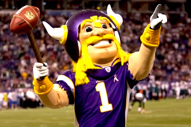
3. Viktor -- I didn't know Viktor before this research, but he's one of my favorites already. Start with the name: It's a pun! Then you get into the quality of his costume. The jersey is forgettable, but he's got a Viking helmet (of course) and blonde hair including a Hulk Hogan-style fu manchu and man braids (!) and Wonder Woman gauntlets (!!) and a butt chin (!!!). But the best part is his hammer, which is a football on a stick. He's friendly and fits thematically. I love Viktor. He looks like the Clash of Clans logo guy found his life's calling.
2. Steely McBeam -- Any of the ones above this point could have won on their own. e best of the "white guys with jobs" group, partly because of his name -- he has a first and last name, and it's great. He doesn't wear a jersey and instead wears the clothes of his trade -- checkered shirt, heavy overalls, gloves and a hard hat. It's as if he just got off the job and came down to the game in his spare time. I also like the 5 o'clock shadow and his own personal steel beam. He's excellent. He looks like if a Perfect Man doll had become a real man, Pinocchio-style, and got a job at the steel mill.
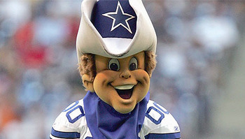
1. Jaxson de Ville -- This is how you do a memorable mascot for a team that's not very memorable. You name him after the city he's in, but change it up slightly enough to work as an actual name. His jersey isn't just a regular jersey, it's got shadowed paw prints on it, like his shorts. He's a jaguar, but he's goofy in the good way -- he's fat and has abnormal (but fitting the team) colors. He's got details like the whiskers and spots and even the omnipresent sunglasses. He's goofy and cool and he stands out while fitting with the team. I'd argue he's the best part of the Jacksonville Jaguars. He looks like if Spuds MacKenzie had been a cartoony Jaguar instead.
Summary Judgments
If you're going to accuse the outgoing director of the Office of Government Ethics of grandstanding, you might want to take the two seconds needed to spell his name correctly. Just a suggestion. • • • Game of Thrones is back. I love it. You have no idea how hard it was to not turn this into a Game of Thrones post. • • • I've been running again, but I'm trying to keep it to reasonable distances. I've run a 5K three times this week, but I need to double that in the next 6-7 weeks. So starting tomorrow, I'm bumping it up quickly. That's both fun and also terrifying and also time-consuming. But it feels good to be back in a groove even though it's approximately Burnt Toast degrees outside, even at 6:30 a.m. • • • The kids are doing well. Evie's turned the corner with potty training, and we think she's got it down for No. 1 and No. 2. Roland will get truly started soon, probably this weekend. Last night, Roland decided he wanted to jump over me (we were wrestling/playing on our bed). His idea of jumping over me is to land, knee-first, on my kidneys, then roll over. I feel like he learned this lesson from Evie. Last week, I needed to pick her up, and asked her to jump in my arms. She chose to go knee-first like a cannonball. That's... not all that comfortable, kid.
No comments:
Post a Comment